Dispute Management Maersk 2024–present
I turned an invoice comparison tool into a decision system
Investigation time dropped from 45–90 minutes to under 10.
Role
Product Designer, owned UI and workflow design end-to-end.
Team
Product Manager, Architect, Frontend Engineers.
Delivered
Discovery research, workflow design, UI design for an automated investigation system, post-launch redesign.
Context
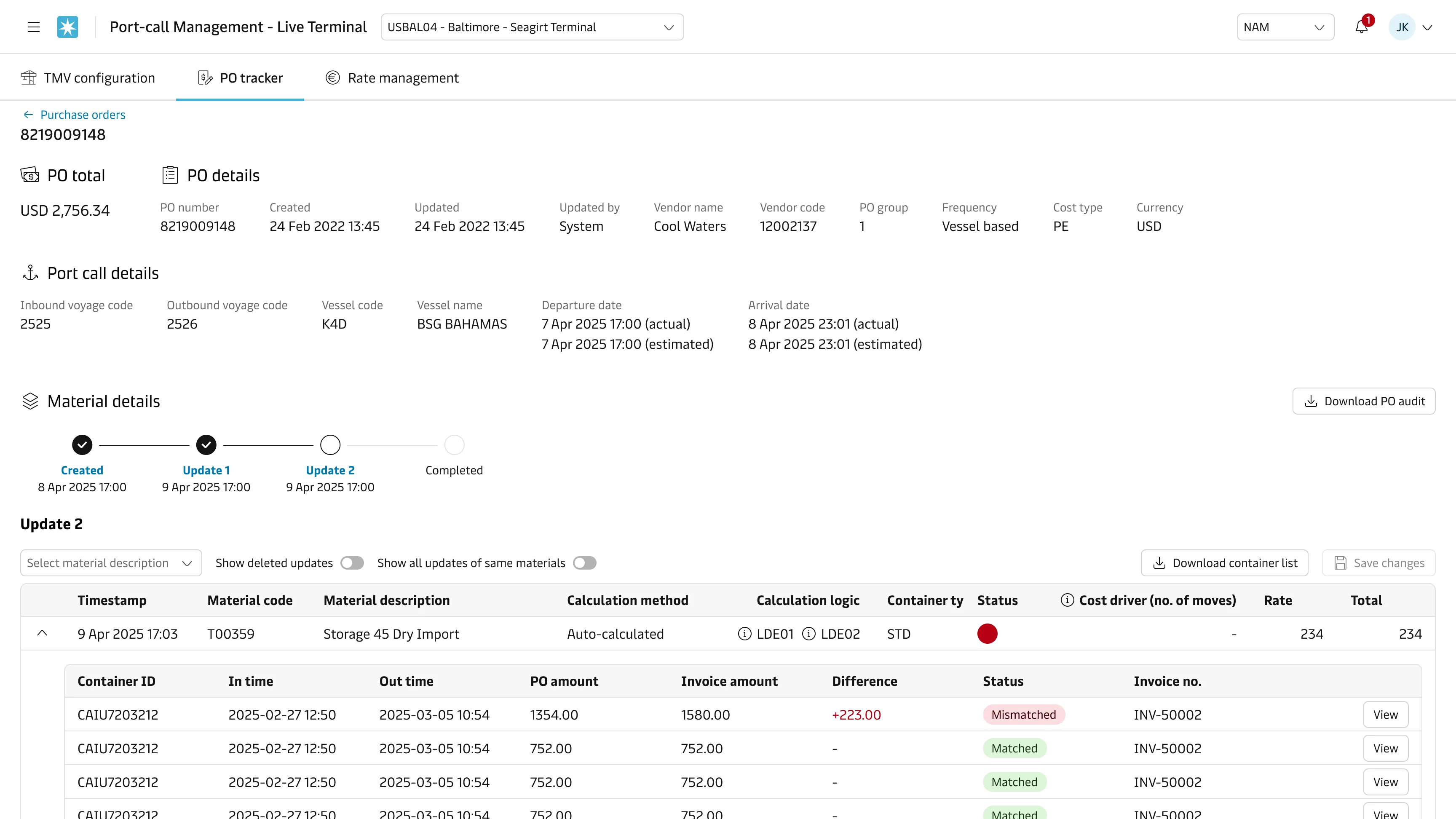
Before this system, PO-invoice mismatch investigations were spread across three teams working from different systems with limited shared context. Each investigation took 45 to 90 minutes, traceability was poor, and investigators spent much of their time reconstructing data from PDFs and emails before they could make a decision.
Strategy
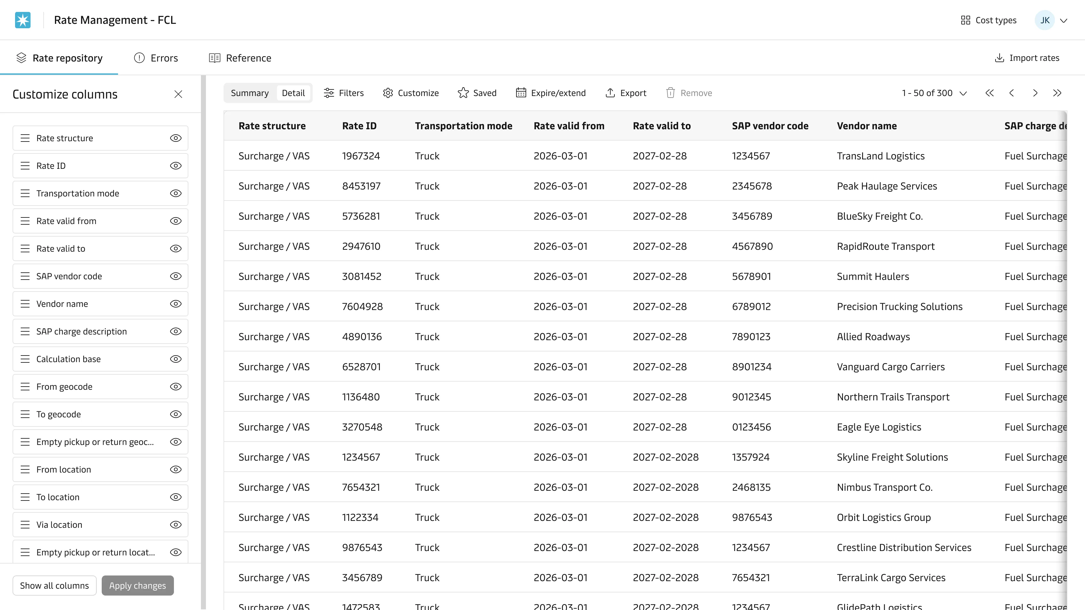
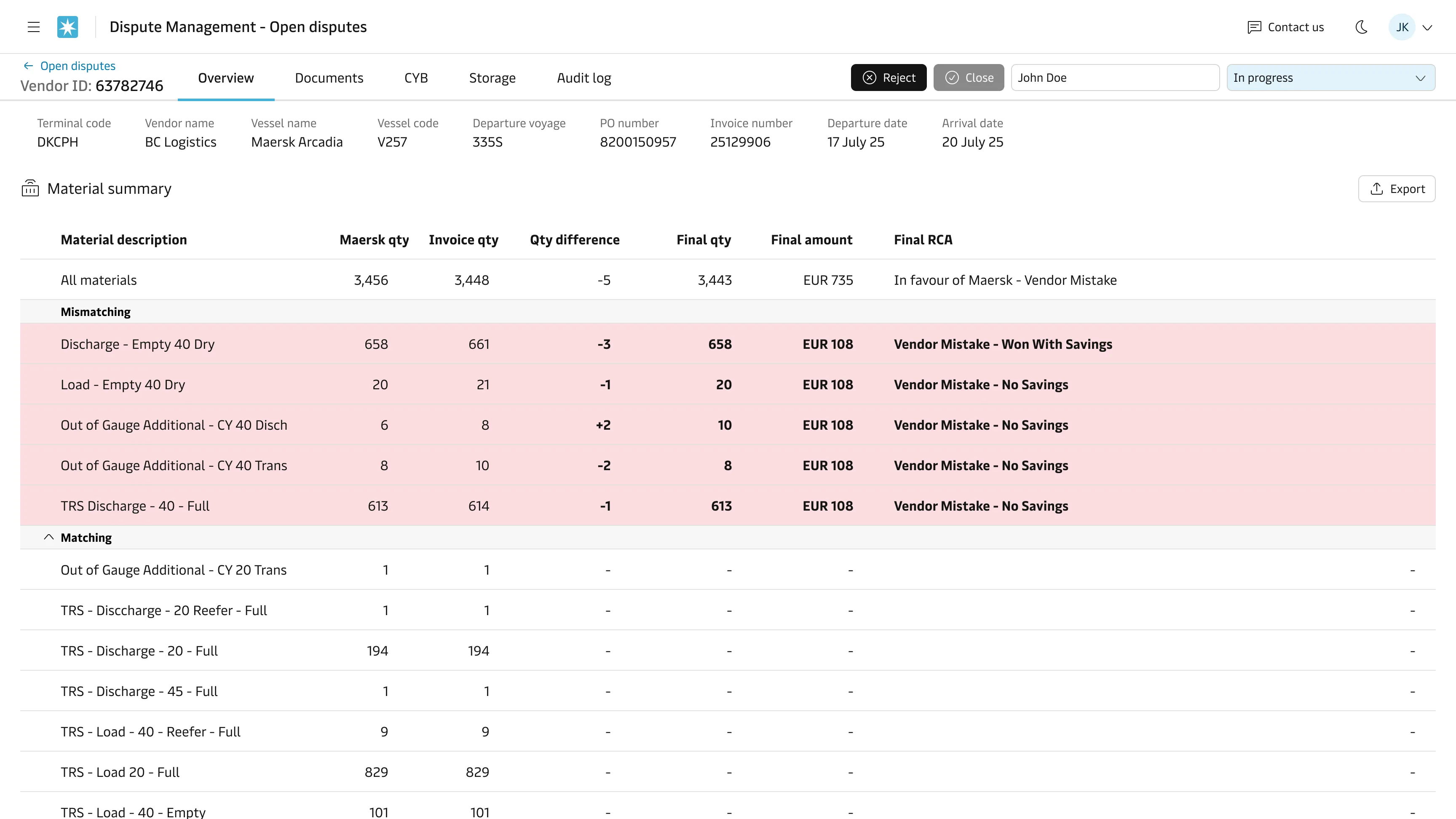
The original framing was a comparison tool that showed people the mismatches and left them to figure out the rest. I pushed for a system that structures the problem and supports the decision, so investigators work from a prepared case rather than raw documents.
That meant treating incomplete data as the default scenario and designing for human-in-the-loop decision-making. Most mismatch investigations don’t have clean inputs, so the system had to guide investigators through ambiguous situations while keeping the underlying logic visible to them. It also meant rebuilding the shared workspace so the three teams could see each other’s progress and hand off between functions.
What shipped and what changed
For quantity disputes, investigation time dropped from 45–90 minutes to under 10, measured against pre-build discovery research and post-launch task analysis. The system now prepares the case automatically, so investigators start from structured data rather than reconstructing it.
“I feel the system is very useful, and it is designed in a very user-friendly way.”
Tradeoffs
I pushed for a cleaner decision system than the data, organisation, and architecture could actually support at MVP. The design moved in a couple of directions I hadn’t planned for.
I’d aimed for it to be the single source of truth, but not all the upstream data was ours to control, so it became a coordination layer instead. I’d also assumed a faster path to automated root cause analysis than the underlying data could support, so the build shipped with a simpler rule-based approach. Investigators still needed to see multiple sources, so I worked on structuring the complexity for them rather than hiding it.
What I’d do differently
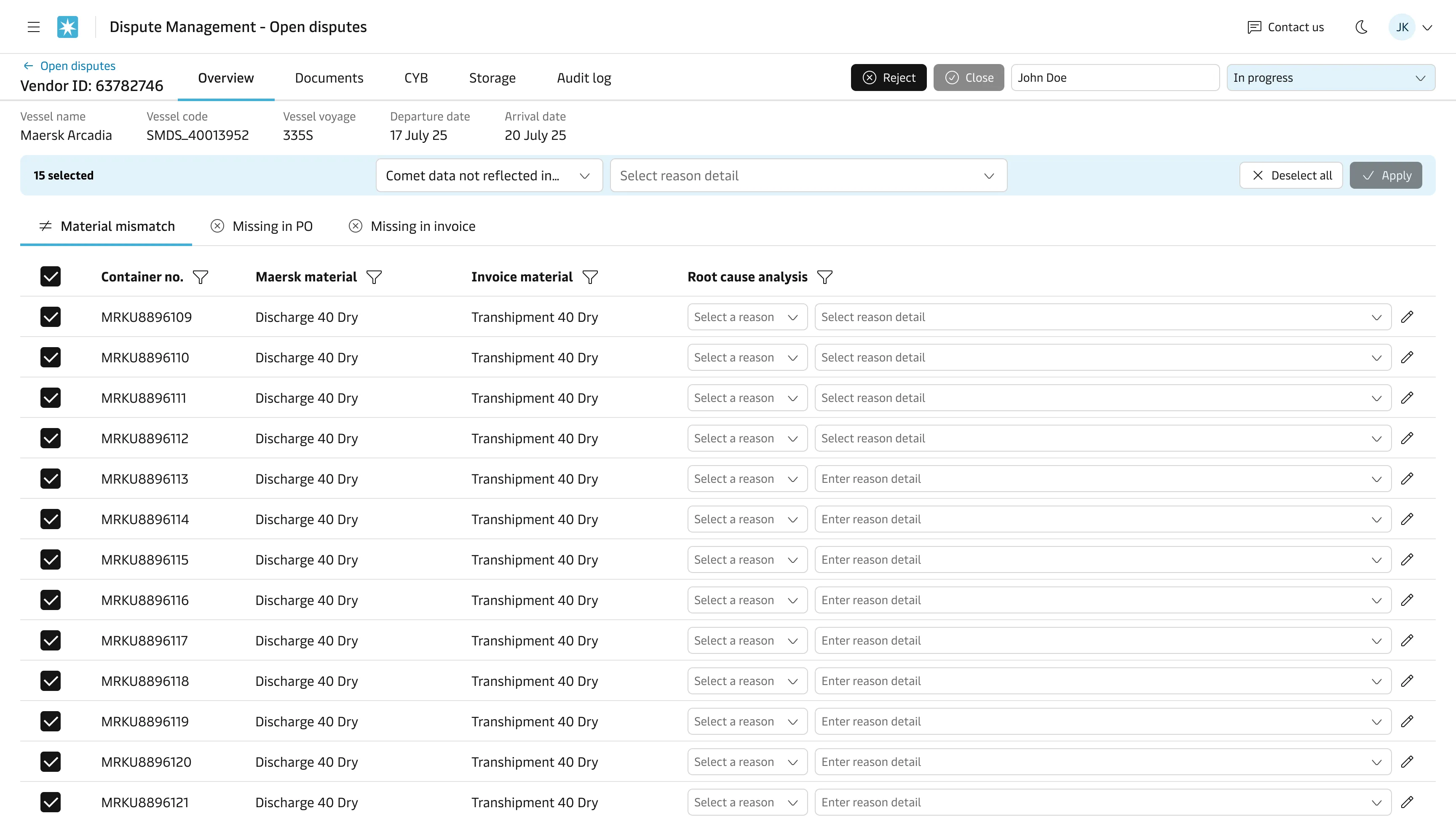
After launch, feedback showed the navigation took up too much space on the root cause analysis screen, hiding container rows the investigator needed to see. I redesigned the nav to be more compact, saving 152 vertical pixels. On a data-dense screen, that change matters.